

Paid traffic usually does not fail because of targeting alone. More often, the click lands on a page that asks the visitor to do too much, trust too little, or think for too long.
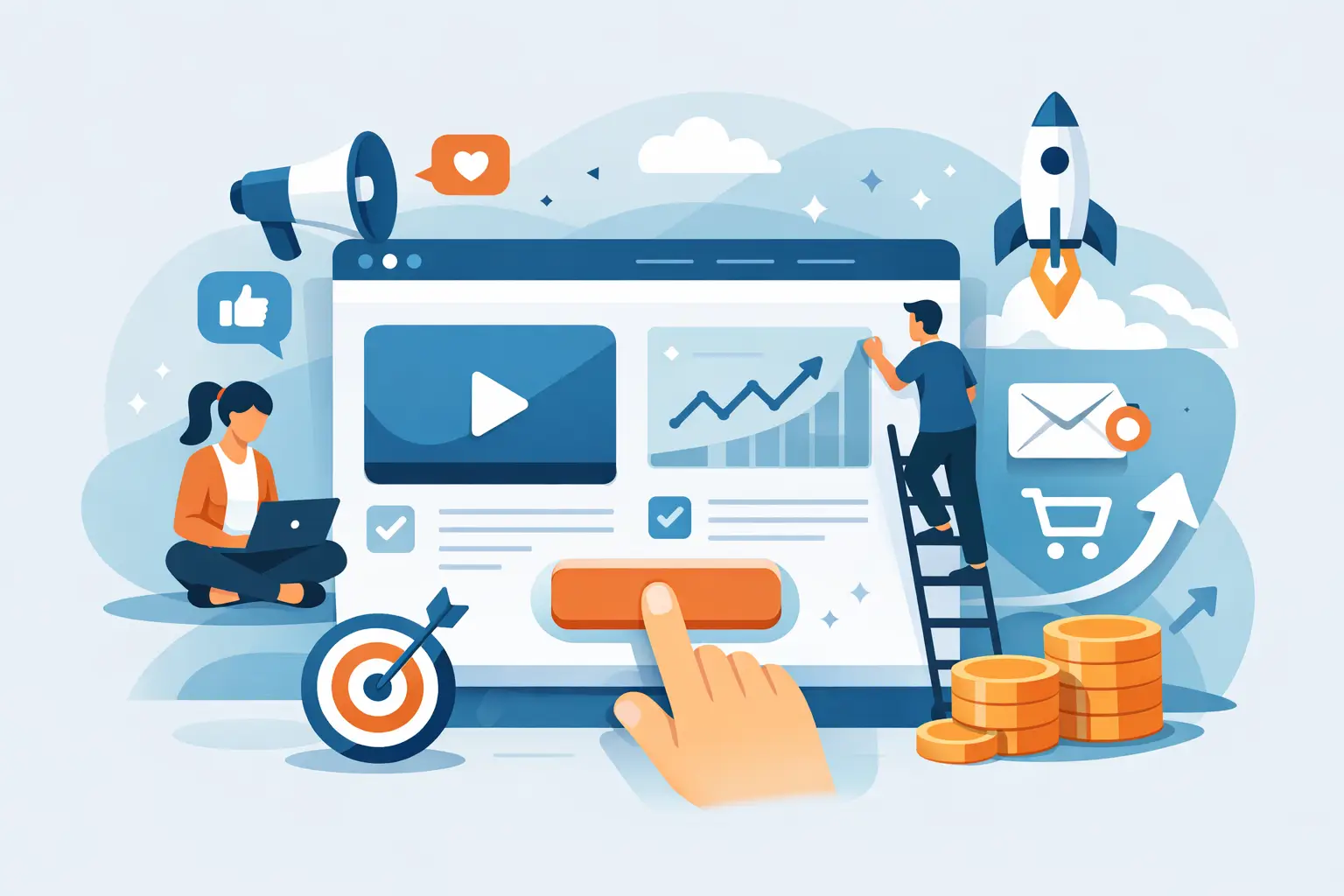
That is why the highest converting ecommerce landing page elements are rarely flashy. They are structured to reduce friction, reinforce intent, and move a buyer from interest to action without creating doubt. If you are spending serious budget on Meta, TikTok, or Google, your landing page is not a design asset. It is a conversion system.
What high-converting ecommerce landing pages actually do
A strong ecommerce landing page aligns three things: traffic source, buyer intent, and offer clarity. When those three line up, conversion rate improves because the visitor does not need to re-interpret what they clicked on.
This is where many brands lose efficiency. Ads promise a specific result, angle, or product benefit, then the landing page shifts into generic brand messaging. That disconnect increases bounce rate, lowers add-to-cart rate, and pushes up CPA.
The best pages are specific. They continue the ad conversation, narrow attention, and answer objections in the order a buyer naturally experiences them.
The highest converting ecommerce landing page elements
1. A headline that matches buyer intent
Your headline has one job – confirm that the visitor is in the right place.
For cold traffic, that usually means leading with the primary problem, benefit, or use case. For warmer traffic, it may be more effective to lead with the offer or a clear product promise. The point is not clever copy. The point is message match.
If your ad says a supplement supports better sleep, the landing page headline should stay close to that promise. If your ad sells a bundle discount, the headline should surface the bundle quickly. Relevance beats creativity when conversion is the goal.
2. A strong hero section with one clear action
The hero section carries most of the decision weight in the first few seconds. It should communicate what the product is, why it matters, and what the visitor should do next.
That usually includes a concise headline, supporting copy, product image or demo visual, price or offer context, and one primary call to action. If you place too many competing actions in this area, attention splits and response drops.
For most ecommerce landing pages, one dominant CTA outperforms multiple equal-weight choices. There are exceptions. If a product has meaningful variant complexity, a “Choose Your Option” CTA can work better than a direct purchase ask. But the page still needs a single next step.
3. Product visuals that reduce uncertainty
Visitors cannot touch the product. Your visuals need to do more of the selling.
High-converting pages typically combine clean product imagery with context. That means showing the item on a plain background and in real use. Depending on the category, close-ups, packaging shots, comparison images, size reference, or short video loops can materially improve response.
The key is reducing uncertainty, not adding visual volume. Ten average images often underperform three useful ones. If the product has texture, fit, ingredients, or before-and-after potential, show that clearly. If it needs assembly or setup, show the process. Good visuals answer the questions that stop a purchase.
4. Benefit-led copy above the fold
Features matter, but they do not convert on their own. Buyers first want to know what changes for them.
That is why benefit-led copy is one of the highest converting ecommerce landing page elements. It frames the product in terms of outcomes, convenience, savings, comfort, appearance, speed, or problem reduction. Features should support the claim, not replace it.
A simple test helps here: if your copy only describes the product, it is probably weak. If it explains why the product is useful in a real buying context, it is more likely to convert.
5. Social proof placed near decision points
Social proof works best when it appears where doubt appears.
That might be directly under the hero CTA, beside pricing, near an add-to-cart button, or before a shipping section. Reviews, ratings, user-generated content, press mentions, and customer counts can all help, but context matters. Generic testimonials buried halfway down the page are less persuasive than proof tied to a specific objection.
For example, if buyers worry about quality, highlight reviews that mention durability. If they hesitate on fit, show fit-specific customer feedback. If you are running cold traffic, creator-style content and first-person product experience can outperform polished brand claims.
6. Clear pricing, offer structure, and value framing
Ambiguity hurts conversion. Visitors should understand the price, what is included, whether a discount applies, and what makes the offer worth acting on now.
This does not mean every page needs aggressive promotions. In some categories, discount-heavy framing can reduce perceived quality. But every landing page needs value clarity. If the product is premium, explain why. If the bundle saves money, quantify it. If a subscription lowers cost per order, show the math simply.
The highest converting ecommerce landing page elements do not hide price until late in the experience. They frame price in a way that supports decision-making.
7. Objection handling before the visitor has to ask
Every category has common conversion blockers. Shipping time. Return policy. Product compatibility. Sizing. Ingredients. Warranty. Safety. Results timeline.
A high-performing landing page handles these objections in sequence, before they turn into exits. That can happen through short FAQ sections, accordion modules, trust badges, comparison charts, or plainspoken copy blocks. The format matters less than the timing and relevance.
This is where many brands improve conversion quickly. They keep adding persuasive copy but fail to remove practical friction. In performance terms, objection handling often lifts conversion more reliably than headline rewrites.
8. Trust indicators that feel specific, not decorative
Trust badges alone will not save a weak page. But specific trust signals can materially improve performance when they reinforce real credibility.
Think secure checkout language, shipping and return clarity, satisfaction guarantees, verified reviews, payment method icons, or category-specific proof such as dermatologist tested, third-party certified, or made in the USA if those claims are relevant and substantiated.
The important distinction is this: useful trust indicators answer risk questions. Decorative trust graphics just fill space. If an element does not reduce anxiety or support a claim, it probably does not belong.
9. Mobile-first layout and page speed
A page can have strong copy and still underperform if the mobile experience is poor. For most paid traffic accounts, mobile carries the majority of sessions. That means thumb-friendly CTAs, fast load times, readable spacing, sticky purchase actions where appropriate, and media that does not slow the page into failure.
Page speed is not only a technical metric. It shapes user behavior. Slow load times reduce engagement before the offer even has a chance to work. The trade-off is that rich media can improve conversion when used well, so the answer is not removing all assets. It is controlling file size, prioritizing essential content, and testing the mobile experience like a buyer would.
Why these elements only work when the system is aligned
Brands often ask which single page element moves conversion the most. The honest answer is that it depends on the bottleneck.
If traffic quality is weak, no headline will fix the economics. If the offer is uncompetitive, adding more reviews will not solve the problem. If tracking is broken, you may optimize the wrong version of the page. This is why landing page performance should be evaluated as part of the full acquisition system, not as an isolated design project.
The pages that scale best usually come from structured testing. One variable at a time. Clear hypotheses. Measurable outcomes. That might mean testing hero messaging first, then offer framing, then proof placement, then checkout-path friction. Random edits create noise. Testing frameworks create learning.
For brands investing consistently in paid acquisition, landing page optimization is one of the fastest ways to improve efficiency without increasing spend. A higher conversion rate gives your media buying more room to work. It can reduce CPA, improve MER, and help profitable campaigns stay live longer.
At Proline Web, that is the standard we care about – not whether a page looks busy or minimal, but whether it converts with consistency under real traffic conditions.
Build for clarity first, then optimize for lift
If you want better landing page performance, start with the fundamentals: message match, offer clarity, objection handling, and mobile usability. Once those are in place, testing becomes far more productive because you are improving a stable system instead of guessing inside a broken one.
The best ecommerce landing pages do not try to say everything. They make the next decision easy, credible, and low-friction. That is what turns paid clicks into revenue.